It has been an exciting journey to get where we are today. At Linguineo, our goal is to make learning a language as effective and easy as possible, so we launched our Learn Words! app in December 2016 as a supplement to Linguineo’s suite of products. Even though the launch was quite successful, there’s always room for improvement, so after the release of Learn words!, we asked more than 40 language teachers to give us feedback on the app.
One of the first things they said was that they needed to be able to share word lists with their students. We agree that sharing lists is important, so that was one of the first things we changed in our upgrade. Sharing lists is now one of many new and useful features in the app. If you would like to see how to share a list, see a quick video tutorial here.
We received many useful suggestions, and agreed that if three or more teachers made the same suggestion, we needed to make those suggestions part of the upgrade. The new and improved version of Learn Words! is now live and available at the app store.
We think it is important that people can see how we are improving the app, so below is a list of the most common suggestions, and our solutions.
1. Users felt they had to pay for everything – this was never our intention!
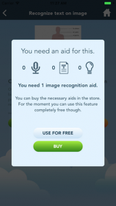
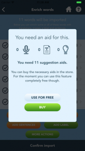
Challenge: Most features in Learn words! are completely free, but to pay for the running costs of our servers we do have to charge the heavy users. Unfortunately, this principle of “pay only if you use it a lot” was not properly reflected in the app. Beginner users were constantly confronted with the ‘unlock content’ dialog, although it was usually for the “Use for free” option. Despite this, users felt like we were asking them to pay for each feature and they were understandably getting frustrated.
Christie Vanorsdale: “I think that the system of paying for each add on separately could be improved. Maybe just have everything for purchase as one ‘package’ upgrade as it seems that you need all of those functions to use the app anyway.”
Solution: Now, when a user is able to access a free feature, this dialog is no longer displayed.
We also increased the usage threshold that applies to heavy users by a factor of 4, so people can use the app for free quite a bit longer. In addition to reducing the number of times users encounter the ‘pay for content’ dialog, and raising the frequent user threshold, we have also bundled all permanent upgrades into one package (they were 3 separate upgrades before).
2. Difficulty creating word lists from images
Challenge: Although we tried to make creating a word list from an image as easy as possible in the initial release, users who weren’t very tech-savvy found the process too complicated.
Keon Esky: “As any other teacher would probably tell you, time is of the essence, so you may want to find a way to render the app a bit more shallow (as in user-friendly).”
Deirdre Steenekamp: “I like the app but uploading a list is a bit cumbersome.”
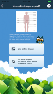
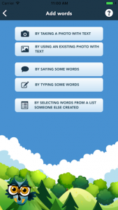
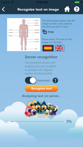
Solution: For each image scan, a user had to indicate whether to use the entire image or only part of it. With our upgrade, it is assumed that the entire image will be used – which will be sufficient in most cases. Users still have the option of cropping the image, but they don’t have to actively decide not to crop with every image upload.
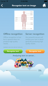
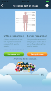
We also disabled the default offline image recognition. Offline recognition was only working well in 10% of the cases and although the app clearly indicated that “in general offline recognition produces low quality results” this was still confusing for our users. Many thought the text could not be recognized at all, but server recognition would have worked in these cases.
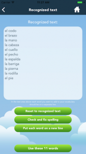
Automatic recognition mode is a brand new feature! Before, users had to manually process the recognized text. Although this was easy to do since there were already some context-aware macros available that could remove all duplicates or punctuation with one touch, the process was still confusing. In the new automatic mode the app analyses the recognized text and decides itself which of these macros to execute to get a word list. Now, users can skip this “text processing screen” altogether.
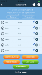
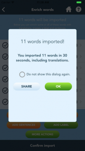
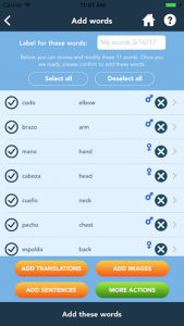
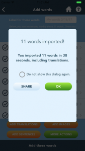
Lastly, the app was not retrieving translations automatically once the recognized text was converted to a list of words even though every user wants these translations. The app will now automatically retrieve the translations. The result is that a user now really only needs to select an image, press “Recognize text” and then decide to add the entire word list with translations or not, which is a much simpler flow.
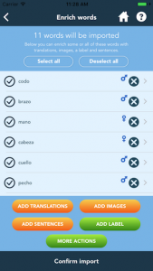
The old recognize words flow – 9 screens
|
|
|
|
|
|
|
|
|
The new recognize words flow – 4 screens
|
|
|
|
3. Too many options
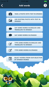
Challenge: Before the upgrade, users had 7 choices when adding words.
Ana Pecanha: “As a student, I think there are lot of options and sometimes having so many options at one’s disposal can make one lose the point.”
Solution: We have reduced this to 5 clearer options, postponing certain decisions to later in the flow. Previously, users had to choose Learn, Exercise or Play, when doing an exercise. Depending on their selection, 10 more options appeared for the exercise type. Now, users only press the Exercise button, and then select one of 5 options. The additional configuration options are still there, but there are no forced selections, and users can begin their exercises right away, using the defaults.
4. Labeling lists was difficult
Challenge: A remark many teachers made was that they wanted to give a label to their word list, but they could not see how to do it. Although this was already possible, the feature was hard to identify.
Graziani Correa: “It is not clear where I put a name for my list and where that name appears later, such as “Parts of the head” or “Animals”. I consider the name of the list something that is important to be visible to guide the studies.”
When adding words, the app did not explicitly ask for a label for the newly added words. The option was there – “Add label” – but most people did not use it. As a result, they were importing words without a label attached to them and had no way to group the imported words again later.
Solution: Now, with each imported list, the app explicitly asks for a label. If a user does not enter one, the app will add one. In addition, the label is now always shown in the “my words” section.
5. It was not possible to load public lists
Teachers did not request that we make it possible for users to upload public lists, but two users asked us how other users could load a public list they created. The option to set a list as “public” was already there, but there was no way to retrieve a list of public lists. Now, this option is available.
6. Other changes
Overall, we have dramatically improved the user experience. In addition to the more noticeable upgrades above, we have also made some smaller improvements because all feedback is important to us and we carefully consider every suggestion.
- Improved user friendliness of the speech exercise. After recording you had to press “stop recording” and then “answer” – you can do this now in one action.
- Easier to amend mistakes in the server suggestions.
- New option to select all words without a label. Before the upgrade, it was only possible to either select all the words or all the words from a specific label. If you wanted to select all words without a label (to assign a label to them for example) you had to select each word manually.
- Attach pictures from your image library to a word without being logged in. Before, this feature was only available to users who were logged in to their Linguineo account.
- More appropriate example sentences. Suggested sentences were often too advanced for students. By default, simpler sentences are suggested now.
We are continually working to improve the functionality and content of the Learn Words! app, but some changes take more time than others. Stay tuned for updates on improved audio and some fun, new games!
Many teachers took time out of their busy schedules to provide us with these comments and suggestions, and we offer them all our sincerest thanks. We are very happy with the results of this teacher consulting round and hope everyone will like the changes!

